visual code
TYPE DESIGN Mar 2020
“What if type was simplified?”
According to research by the Linguistics Department at Cambridge University, once a person has mastered the alphabet and acquired a vast vocabulary, it is easy to pick out misspellings, reversed letters, or guess words that are missing in a sentence.
It deosn’t mttaer in waht oredr the ltteers in a wrod are, the olny iprmoetnt tihng is taht the frist and lsat ltteer be at the rghit pclae. The rset can be a total mses and you can sitll raed it wouthit porbelm. Tihs is bcuseae the huamn mnid deos not raed ervey lteter by istlef, but the wrod as a wlohe.
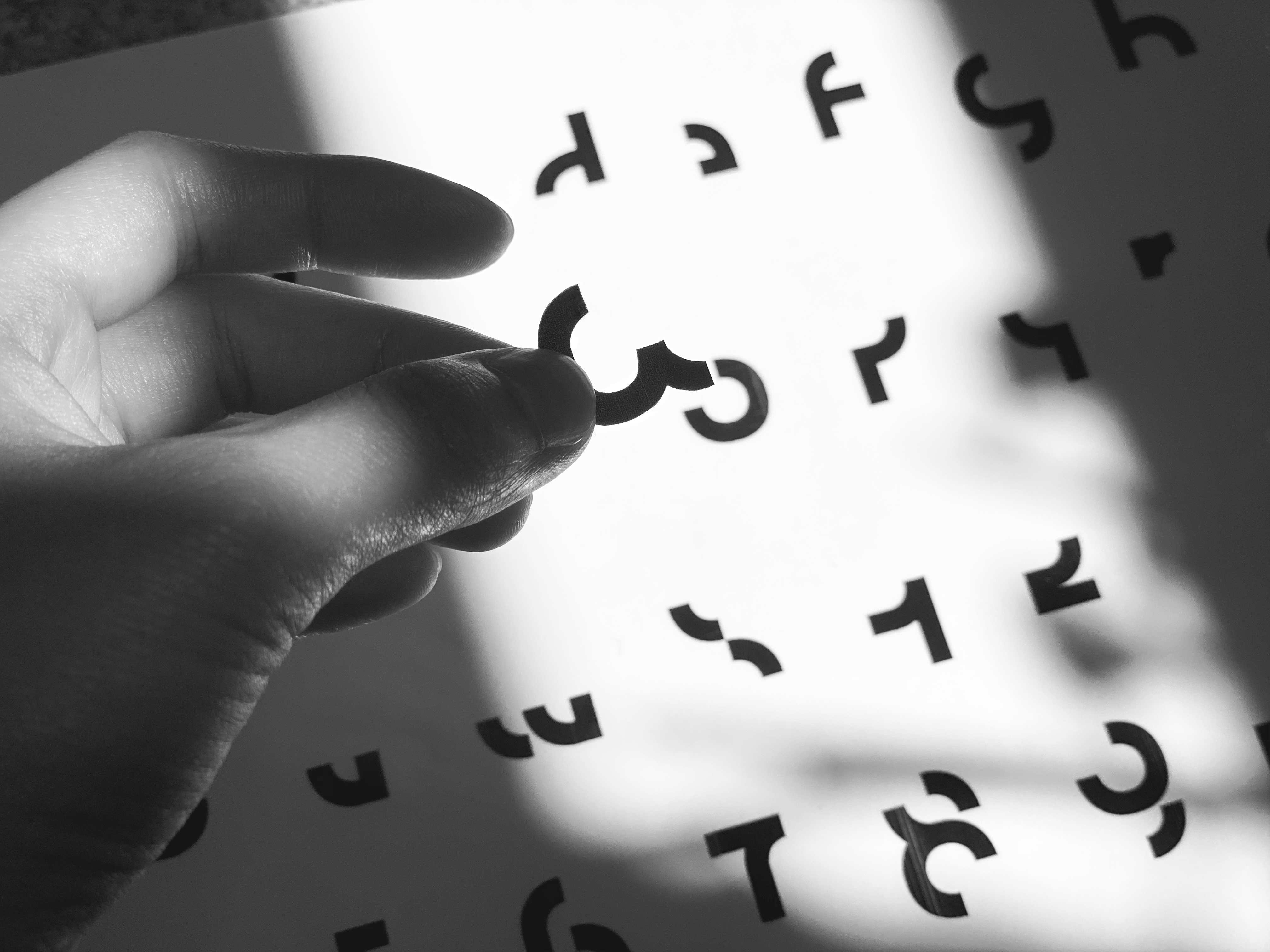
The future type I have developed explores the way people read a word. The idea behind this work is to question the legibility of letterforms in terms of communicating information - as the human mind does not read a word by each letter but a word as a whole, will the letterform affect people’s reading experience if it becomes more simplified?
The typeface in some way restructured the connection between each letter and was designed to reduce the parts of each letter that we do not necessarily need.
Letterform as a high abstractive summary of language can be seen as a “visual code” which communicates all kinds of information. The narrative structure of typography could be more flexible, as this kind of “visual code” can be applied so broadly when considering how humans make meaning and extract it from what they can see. It sets a precedent for developing a new, wider “database” for communication and the expansion of how we can visually perceive the communicative process.
“如果字体被简化了?“
基于剑桥大学语言学系的研究,一旦一个人熟悉掌握了字母表且掌握了大量的词汇,就很容易找出拼写错误、排列顺序颠倒的字母或是猜出句子中缺少的单词。下面一段话由拼写顺序错误的单词组成。
大意:无论一个单词中组成字母的顺序如何,只要第一个字母和最后一个字母在正确的位置,剩下的字母可以混成一团你依然可以认出这个单词。这是因为人们的大脑并不是逐字逐句地按字母顺序阅读,而是把它们看成一个整体作为单词阅读。
我设计的这套未来字体意在探索人们阅读文字的方式。项目背后的概念是在交流信息的方面探讨字体的易读性和可辨认性,如果字体变得更加简化,会不会影响人们的阅读体验。
未来字体在某种程度上重组了每个字母之间的连接,并减去了不影响字母的可辨认性的部分。
字体作为语言的高度抽象总结,可以被看作是一种传达各种信息的“视觉代码“,它开发了一套新的交流“数据库“使得排版或字体设计的叙述结构可以变得更加灵活。


latin Glyphs | Basic Characters